Monday, March 30, 2009

Zuster


I adore Zuster. I had the pleasure of working with sisters Willy, Katrina and Fleur through my job at Cite, where I managed the showroom and looked after all retail and small commercial clients. We became their suppliers to the Canberra region after one of my clients introduced me to their beautiful products. Not only are they the lovliest (and most attractive!) girls you could meet, they have the most wonderful can-do approach to not only their designs, but their customer service as well.

I am planning our new kitchen and it is partly inspired by one of their product lines, the April, and a finish they used called Dune. It is a beautiful limed American Oak, almost pearlescent to look at with those gorgeous grain lines coming through. I would love to have the 2400mmL April table with two matching benches, upholstered in a dark grey to almost blackish fabric.

Here are some more images of their stunning work:


Jack Merlo Design


After my last post, I had another look at the JMD website and saw this 'Cocoon Garden' exhibit. Die.

The colours, the timber, the organic shape, the furnishings, the water, the plants. I have died and gone to heaven.

The Garden


Jack Merlo Design

The people who lived in our house before us were retired gardeners. Our property was pretty much full of trees, plants and sprouting bulbs when we moved in. I wouldn't say that it was my type of garden per se, but I could appreciate the hard work they had put in. Luckily they moved to Far North QLD.

Canberra, and most of Australia, is in the grip of the most horrific drought of all time......and while I can use this as a large part of my excuse for the current state of the garden, the rest just comes down to laziness on top of a complete lack of time. I am wondering how people do find the time to keep their gardens looking ship shape? Do they forgo the essentials of eating, washing and vacuuming, with the insides of their homes looking like the some war zone?

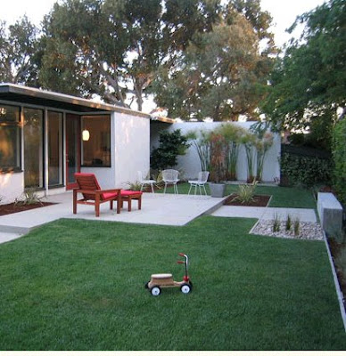
Anyhow, I am keen to re-do our garden in a much more family friendly, drought-tolerant and design-savvy way. I have been collecting images that speak to me and am starting to gather ideas for our little space. Here are just a few to get things rolling:


Sunday, March 29, 2009

House numbers

We have the ugliest letterbox known to mankind. I think it's actually an old metal toolbox flipped on it's side and wedged between three pieces of timber. Of course it's been lovingly painted terracotta and heritage green by the previous owners (the same delightful colours as the rest of the trim on our house), but there ain't no disguising it's brutality.

Along with the letterbox comes the standard issue cheap-arse stick-on metal number thingy. I cannot wait to demolish this eyesore. I've lived with it for nearly four years, but haven't done anything about it as a) it's functional, and b) I don't really have a cohesive plan for the garden yet, and my analness makes me want to help it blend in when the time is right. I have a thing about numbers though. It's one of the first things anyone sees when they come looking for your place. It's got to be right, and so here are a couple that I'm loving:


from Home Beautiful July 2007

I love all these numbers, particularly the colours in the last image (our house will eventually be a dark charcoal colour and a bright red number just looks so fab). My only concern is that our house is number 8, so whatever we end up doing, it can't lose it's punch by only having one digit. A big red number 8 would look awesome. We could always spell the word 'eight', but that is just too overdone these days. Hmmmm.

House inspiration

Falling Water by Frank Lloyd Wright

In May, it will be four years since we moved into our house. Prior to moving, we lived in a one bedroom apartment in the City. I used to dream about the luxury of space and I craved actually having somewhere to put everything. Now that I have it, I SO take it for granted. One of the main reasons we purchased this particular house is because I am a Modernist at heart, and having a flat roofed house with huge windows was the closest I would ever come to a little slice of Frank Lloyd Wright or Richard Neutra's horizontal planes in my life. It may not look anything like Falling Water....but a girl can dream.

Here are a couple of famous modernist houses that make me go a bit weak at the knees. I take inspiration from these for our own little place. We haven't really touched it yet, it needs a huge overhaul and some sexying up. 2009 is to be a year of action! Some more realistic inspiration to come.....


Singleton Residence by Richard Neutra


Farnsworth Residence by Mies van der Rohe


The Glass House by Philip Johnson


Pierre Koenig house, Hollywood Hills


Rose Seidler House


Welcome


Hello blogland! I am completely new to this, so have no idea what I am doing. I'm planning to learn it all along the way.

This will be my visual diary, for recording some of life's events and for putting in one place all the things that inspire and move me.

Welcome to Hopscotch!